Kai
Brooks
Product designer crafting thoughtful digital experiences.
Projects
Role: UX + Visual Design
Timeline: 1 month
Tools: Figma, E-Commerce Site Builder
Problem
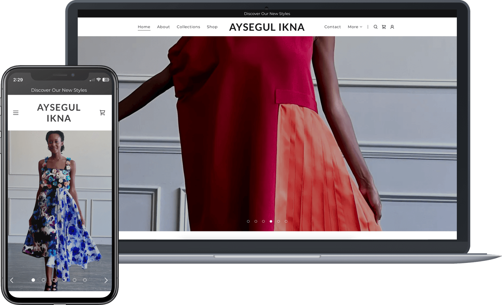
The website for fashion designer Aysegul Ikna lacked cohesion, which made it hard for users to trust and engage with the brand. The outdated look did not reflect the elegance or values of sustainable fashion.

Research
To better understand the market I analyzed competitor websites focusing primarily on landing and product pages. The insights revealed clarity, elegance, and a more cohesive branding.
Solution
I delivered a refreshed site with easier navigation, a modern color palette, and more organized sections. I improved the overall visual hierarchy and ensured products were easily found via seasons.
Testing & Feedback
An agile approach was deployed and the project was complete in a few weeks. Early changes were tested quickly with users and I worked closely with the designer to gather real time feedback.
Reflection
I loved working on this project for its creative simplicity. It was a joy to work in a field that aligns so closely with my interest in sustainable fashion. Yes that is me in the mockups! I also helped with some modeling.
Role: UX/UI Designer
Timeline: 1.8 years
Tools: Figma

Team size: 4 (sole designer)
Problem
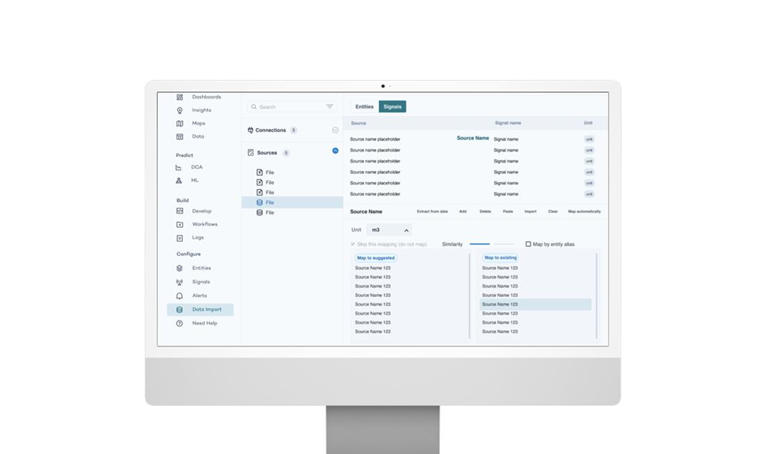
The original PetroVisor interface was not designed for commercial use and was a pain for engineers to find and properly analyze their data. The app lacked the visual clarity as it was difficult to navigate and scale.
Testing & Feedback
I tested my prototypes within the technology team and oil engineers to identify weak points. We adopted an agile approach, making changes quickly. I held a weekly UX meeting within the technology team to enhance the app's UI gradually.
Problem
The original PetroVisor interface was not designed for commercial use and was a pain for engineers to find and properly analyze their data. The app lacked the visual clarity as it was difficult to navigate and scale.
Reflection
This project helped me gain real confidence in my design voice. Working with engineers and the IT team pushed me to communicate more clearly and trust my instincts. I also learned how powerful design systems can be for creating clarity and confidence across a product.
Solution
I developed the initial design system for PetroVisor and completely redesigned the app reflecting Datagration's brand in a user-friendly site. I designed a myriad of screens from on-boarding to dashboard insights, as well as data visualization. I designed the light and dark mode version of the app while honoring visual hierarchy and basic UX principles.
Services
For Fun
Role: UI + Visual Design
Timeline: 1 day
Tools: Figma
Team size: 1
Dribbble Featured Content
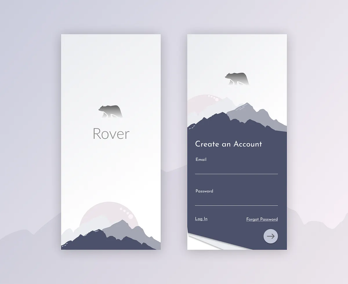
I designed a sign up page screen for UX design challenge. Check it out.
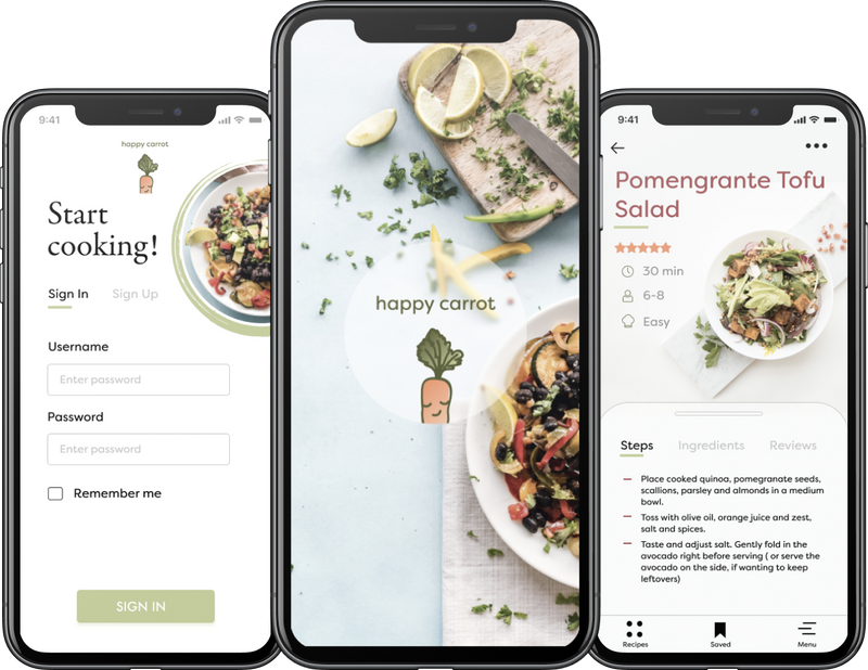
Role: UX + Visual Design
Timeline3 months
Tools: Figma
Team size: 1
Personal Project
I designed a plant -based recipe mobile app called Happy Carrot. Check out the live prototype in Figma.
Contact

